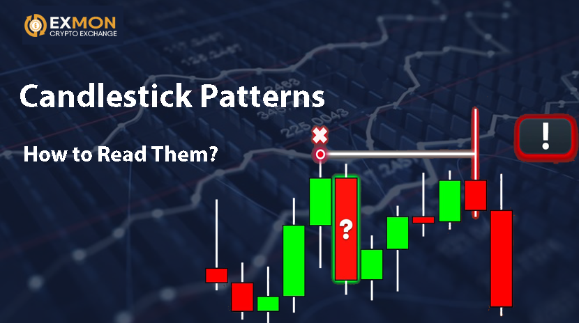
In trading on financial markets, candlestick patterns are a crucial tool in technical analysis that helps investors and traders predict future price movements based on historical data. Candlestick charts, first used by Japanese traders in the 17th century, remain one of the most popular and effective methods of analysis in the markets today.
But what exactly are candlestick patterns? These are specific combinations of candles on a chart that can indicate changes in the market trend. Reading candlestick patterns requires attention to detail and the ability to interpret subtle signals they send.
1. How Candles Are Structured
Before diving into patterns, it's important to understand how individual candles work. Each candle on the chart displays four key parameters:
- Open: The price at which the market opened during a specific time period.
- Close: The price at which the market closed at the end of the period.
- High: The highest price reached during the period.
- Low: The lowest price reached during the period.
On the chart, this is represented as a rectangle (the body of the candle) and two lines (the shadows) extending from it. If the closing price is higher than the opening price, the candle is typically white or green (bullish trend). If the closing price is lower than the opening price, the candle is black or red (bearish trend).
2. Types of Candlestick Patterns
Candlestick patterns can be divided into two broad categories: single and multi-candle patterns. Let’s take a closer look at both, with examples.
Single Candle Patterns
Doji — One of the most well-known candles. It has a very small body where the opening and closing prices are almost identical. It signals indecision in the market and can often be a reversal signal, especially when it appears after a strong trend.
Example: After a strong market rally, a Doji appears. This might signal that the buyers (bulls) are losing strength, and the market is ready for a correction.
Hammer — A candle with a small body at the top and a long lower shadow. It typically appears at the bottom of a downtrend and signals a potential reversal.
Example: After a prolonged downtrend, a hammer forms. This might indicate that the sellers (bears) have exhausted their strength, and the trend may be shifting toward a bullish phase.
Engulfing — A pattern made up of two candles. In the case of a bullish engulfing, the second candle completely covers the body of the first one and closes higher than the first candle’s open. In a bearish engulfing pattern, the second candle closes lower than the first.
Example: On a chart with a downtrend, a bullish engulfing pattern appears. This can indicate the start of an upward trend.
Multi-Candle Patterns
Three Stars in the South — A three-candle pattern that appears during a trend reversal. The first candle is bearish, the second is a Doji or small-bodied candle, and the third is bullish, closing higher than the previous candles.
Example: This pattern often appears at market bottoms after a strong decline, indicating the start of a rally.
Three White Soldiers — A pattern made up of three consecutive bullish candles. Each subsequent candle closes higher than the previous one, indicating strong upward momentum.
Example: If three white soldiers appear after a long decline, it could signal the end of a bearish trend and the beginning of an upward trend.
Dark Cloud Cover — A bearish pattern that consists of two candles. The first is a bullish candle, and the second opens above the first candle’s close but closes below the midpoint of the first candle’s body. This signals a potential shift to a downtrend.
Example: This pattern may appear at the top of an uptrend, suggesting the trend may be losing strength and a reversal could be underway.
3. How to Properly Interpret Candlestick Patterns
Reading candlestick patterns is not just about identifying specific figures; it's about understanding their meaning in the context of the market. Several factors should be taken into account:
- Trend: Candlestick patterns can indicate a reversal or continuation of the current trend. For example, a hammer at the bottom of a downtrend signals a reversal, while the Three White Soldiers pattern in an uptrend suggests the trend will continue.
- Volume: Confirmation of the pattern with volume is also crucial. For example, if an engulfing pattern is accompanied by high volume, it strengthens the signal and increases its accuracy.
- Context: Patterns should always be interpreted in context. A hammer candle may not always be a reversal signal if it forms during a highly volatile trend.
4. Example of Using Candlestick Patterns
Suppose you're analyzing the stock chart of a company. After a long downtrend, you see a hammer pattern, followed by a series of bullish candles. This could signal the beginning of a recovery. However, for confirmation, you would want to see higher volume during the next bullish candle.
It’s also important to understand that candlestick patterns don’t always offer 100% certainty. They can fail, especially if they form in volatile or choppy market conditions. For this reason, traders often use candlestick patterns in conjunction with other tools like indicators and support/resistance levels.
Conclusion
Candlestick patterns are a powerful tool for market analysis that can help traders pinpoint reversal points, trend continuations, and other key market signals. However, to use them effectively, one must learn how to interpret them properly and within the right context. Candlestick charts not only provide information about past price action but also offer clues about potential future trends, making them an essential part of every trader’s toolkit.


