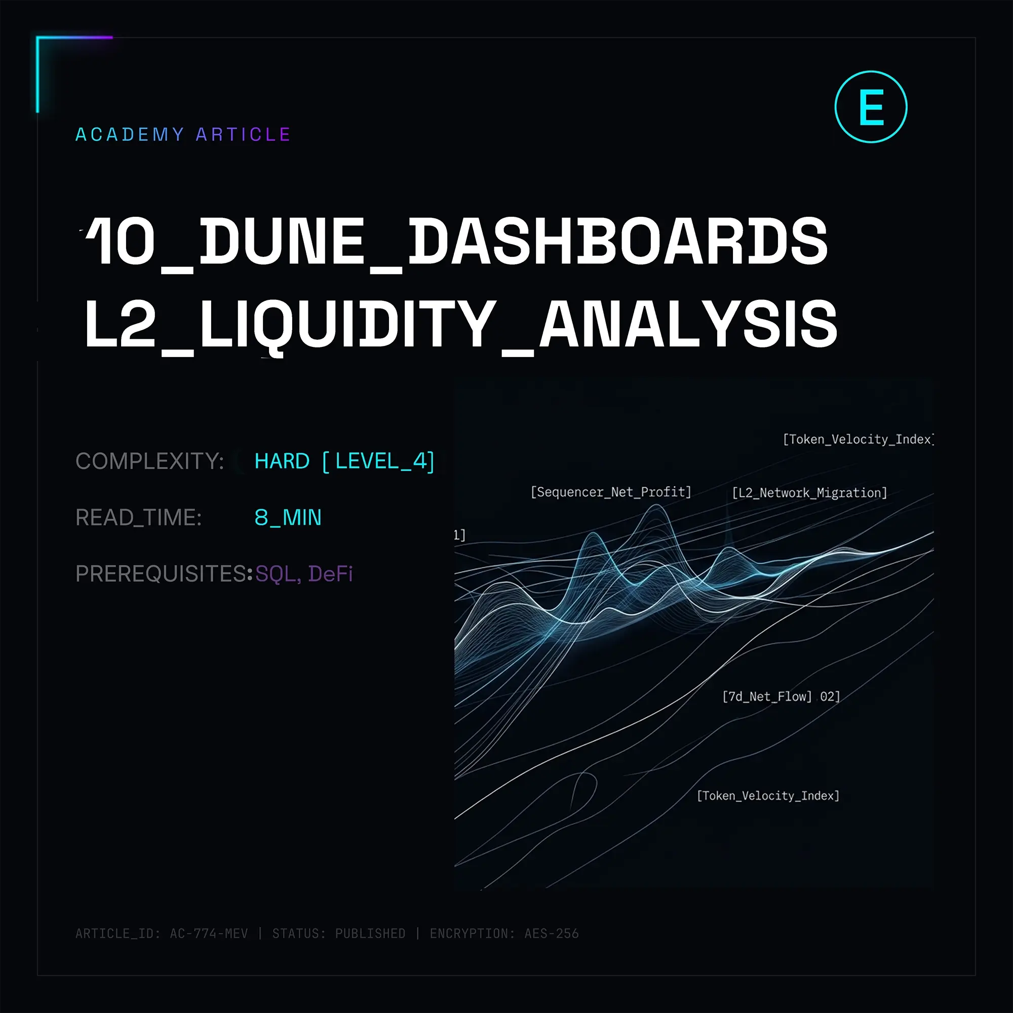
Analyzing Liquidity Flows across Layer 2s is high-stakes alpha hunting—where your run-of-the-mill TVL metrics are basically dead on arrival. In today’s mature multi-chain ecosystem, L2 metrics are constantly getting pumped by restaking, looping DeFi strategies, and native network token incentives. Real institutional capital and Smart Money leave footprints elsewhere: in native bridge contracts, transit liquidity pools on intent-based protocols, and gas consumption hotspots.
For any serious analyst, market maker, or quant trader, Dune Analytics (powered by DuneSQL) has long been the industry standard. Below is a deep dive into the top 10 Dune dashboards to deconstruct capital movement between Ethereum (L1) and L2s, spot anomalies early, and track potential institutional liquidations.
1. L2 Bridge Flows & TVL Breakdown (by @neil_zz)
This dashboard is your macro baseline. Forget the aggregate TVL, which is mostly noise. This breaks down capital into three clean buckets: Bridged (pure capital locked in L1 bridge smart contracts), Native (tokens minted natively on L2), and Externally Bridged (liquidity routed through third-party protocols like LayerZero or Wormhole).
The real edge here is tracking Net Inflows. When an L2’s native bridge (e.g., Base or Arbitrum) sees a massive spike in stablecoin deposits within a 48-hour window, it’s a leading indicator of a local DeFi season—usually before the DEX volume charts even start to reflect it.
| L2 Network | Bridged TVL (USD) | Net Flow (7 Days) | Dominant Asset |
|---|---|---|---|
| Arbitrum One | $14.2B | +$340M | ETH (54%) |
| Base | $8.1B | +$620M | USDC (61%) |
| OP Mainnet | $6.8B | -$110M | OP (42%) |
| Linea | $1.4B | +$45M | WETH (70%) |
2. Optimism & Superchain Economic Engine (by @optimismfnd)
This is the official spot for monitoring the Superchain infra (OP Mainnet, Base, Mode, Zora, etc.). The focus isn't just on transaction counts, but on L1 Batch Submission Fees—the cost of the L2 sequencer posting data to Ethereum.
The Alpha: Pros watch the sequencer margin (Sequencer Revenue minus L1 Data Fees). When a network upgrade drops the cost to post batches while user activity stays hot, the L2 starts printing net ETH profit. This dashboard is key for calculating the Real Yield and fundamental valuation of L2 governance tokens, stripping away the speculative hype.
3. Base Ecosystem Deep-Dive (by @salva)
Base is basically the king of retail onboarding right now. This dashboard tracks User Retention Cohorts and how liquidity is actually structured.
Here’s the TL;DR: keep an eye on the ratio of transaction volume to bridged stablecoin volume. If you see stablecoin inflow spiking while the unique address count stays flat, that’s whales or institutional Coinbase clients moving serious capital into the ecosystem to ape into DeFi.
4. Bridge Net Inflow/Outflow Tracker (by @cryptokoryo)
Cryptokoryo is a legend for a reason. This solves the data fragmentation problem by pulling together flows from both canonical bridges and third-party aggregators like Across, Stargate, and Synapse.
The Heatmap here is elite. It’s not just about one chain; it’s a matrix showing exactly where capital is leaving and where it’s landing. If $200M moves from Arbitrum straight into Base without touching L1, you know exactly where you need to move your liquidity to catch the better APYs.
5. Gas Alpha & L2 Comparative Gas Fee Analytics (by @cryptokoryo_research)
This focuses on transaction costs and block space efficiency. Since EIP-4844 and the shift to Blob space, the L2 cost structure has fundamentally flipped.
-- DuneSQL dbt model for calculating L2 sequencer margins
-- Real-time tracking of network economic efficiency
WITH sequencer_revenue AS (
    SELECT
        block_time,
        -- Total gas paid by users on L2, denominated in native ETH
        SUM(gas_used * gas_price) / 1e18 AS l2_revenue_eth
    FROM ethereum_l2_blocks.transactions
    WHERE block_time >= NOW() - INTERVAL '30' DAY
    GROUP BY 1
),
l1_data_costs AS (
    SELECT
        block_time,
        -- Costs for publishing batches/blobs to L1 (Ethereum)
        SUM(gas_used * gas_price) / 1e18 AS l1_cost_eth
    FROM ethereum.transactions
    WHERE to_address = 0xDEADBEEF... -- The L2's bridge/inbox contract on L1
      AND block_time >= NOW() - INTERVAL '30' DAY
    GROUP BY 1
)
SELECT
    r.block_time,
    r.l2_revenue_eth,
    c.l1_cost_eth,
    -- The net profit margin for the sequencer operator
    (r.l2_revenue_eth - c.l1_cost_eth) AS net_sequencer_profit_eth
FROM sequencer_revenue r
JOIN l1_data_costs c ON r.block_time = c.block_time
ORDER BY r.block_time DESC;
6. L2 DEX Volume & Market Share Matrix (by @hildobby)
Hildobby’s dashboard is a must-have to dissect DEX volumes. A high TVL doesn't mean much if the capital is just sitting idle—real action happens on the DEXs.
This tool lets you track Capital Efficiency (Volume/TVL). If Arbitrum’s Uniswap v3 pools are hitting a 1.5 ratio while a competitor is sitting at 0.2, the first network has way more volume per dollar, meaning better fee income for LPs and more incentive for pro market makers to stick around.
7. Institutional Liquidation & Lending Market Risk (by @21shares)
This is a pro-grade dashboard from 21Shares that monitors lending protocols like Aave, Radiant, and Morpho on L2. It visualizes "liquidation walls"—the exact price points where massive collateral stacks get nuked and force-sold.
The Alpha: MMs and whales use this to front-run cascading liquidations. Because L2 liquidity is usually thinner than L1, a massive liquidation can cause a 5–10% price slippage. Smart traders use this data to set limit orders in the "danger zone," picking up assets at a discount during the panic.
8. Intent-Based Infrastructure Flows: Across & Bridge Aggregators (by @amytong)
In 2026, old-school bridges are getting smoked by Intent-based bridges, where users don't wait for L1 confirmations and instead get instant fills from solvers. This dashboard tracks Across and similar setups.
It monitors imbalanced routes. If solvers are flooding their own capital into one specific chain to meet user demand, it’s a clear signal of organic demand that the standard TVL trackers are likely missing.
9. Arbitrum Ecosystem Tokenomics & Token Velocity (by @blockworks_res)
Blockworks dropped this to move past basic wallet counts and track Token Velocity—how fast the ARB token is actually moving within the ecosystem.
High velocity combined with lower inflows to CEXs is a super bullish signal. It means the token is actually being used in DeFi (as collateral, LPing, or in derivs), which eats up the circulating supply and kills selling pressure.
10. Stablecoin Supply Dynamics Across L2s (by @defillama)
DeFiLlama’s Dune dashboard is goated for SQL-based analysis of stablecoin supply (USDC, USDT, EURC) on L2. Stablecoins are the lifeblood of any chain—the way they’re minted tells you how "grown up" the network really is.
Focus on the share of native vs. bridged USDC. Native minting from Circle kills the bridge risk. Once a network hits 80%+ native USDC, institutional capital usually gets much more comfortable moving in, as they no longer have to worry about the underlying L1 bridge contract getting drained.
Practical Guide: Detecting Wash Trading on L2s
Don't just trust the dashboards; verify the data. Because gas is basically free on L2s, Wash Trading is rampant—dApps fake volume to shill themselves to VCs.
Here is a battle-tested script to flag wallets cycling volume back and forth between two pools to fake activity.
-- Detecting wash trading cycles on L2 DEXs
WITH raw_trades AS (
    SELECT
        block_time,
        tx_hash,
        project,
        trader AS wallet_address,
        token_a_symbol,
        token_b_symbol,
        token_a_amount,
        token_b_amount
    FROM dex.trades
    WHERE block_date >= NOW() - INTERVAL '7' DAY
      AND blockchain = 'base' -- Testing against the high-activity Base environment
),
frequent_traders AS (
    -- Flagging wallets with absurd tx counts
    SELECT
        wallet_address,
        COUNT(DISTINCT tx_hash) AS total_txs,
        COUNT(DISTINCT project) AS platforms_used
    FROM raw_trades
    GROUP BY 1
    HAVING COUNT(DISTINCT tx_hash) > 500 -- The high-freq bot threshold
)
SELECT
    t.wallet_address,
    t.tx_hash,
    t.block_time,
    t.project,
    t.token_a_symbol,
    t.token_b_symbol,
    -- Time delta between the wallet's consecutive txs
    t.block_time - LAG(t.block_time, 1) OVER (PARTITION BY t.wallet_address ORDER BY t.block_time) AS time_delta
FROM raw_trades t
JOIN frequent_traders f ON t.wallet_address = f.wallet_address
ORDER BY t.wallet_address, t.block_time ASC
LIMIT 100;
This is your first filter. If the time_delta is consistently under 12 seconds and the trades are mirrors (Token A -> Token B, then B -> A), it's a bot. If you see this, that dApp's volume is complete fake news—don't trust it.
A8UZ6-